The one with the last two weeks - Finishing up
- bs266757
- Jan 12, 2023
- 6 min read
For these last couple of weeks i split my time up into four sections to focus on, the kitchen, the main living space, the space at the back and then post processing and cinematic to finish it off.
The kitchen -

I was happy with the modelling done for the kitchen and only had a couple of models I wanted to add or change, like the apples for the fruit bowl and the hanging lights. When at this step I realised a flaw in my work flow when it came to my repeatable assets. What I should of been doing was modelling and Uving that singular model before duplicating it and placing the other models since I feel like I wasted time placing all these models at the time that I eventually just deleted to replace them with a Uved version to save myself having to UV every single asset. While Uving my assets I also took time to add in more bevels when needed and also to remove any unnecessary faces on the objects.

I then imported everything back into unreal and started on texturing. I was quite unhappy with how it was looking with the colour blocking since I think the colours were too vibrant and off putting. I really wanted to add some realism to the bottle textures and so made them slightly transparent. I at first had an issue with this and struggled setting up the material within unreal but watched a tutorial and was able to make several textures with transparency.

Some of the notable textures included in the kitchen are the curtain and chair materials. I made these textures by creating a floral tillable pattern, the first variation being a slightly lightened version of the original design just so it looked more realistic and the other two having had a colour overlay on top of them for the purple and yellow kitchen chairs. I drew the original image in procreate and made it a tillable texture in designer. I also gave the material a basic texture of noise to indicate the material being fabric. I was really happy with how these turned out and the subtle detail it added to the kitchen chairs.


A technique I learnt in the texturing process that I wish I had leaned sooner was the use of overlaying a colour within unreal to change the colour of a texture instead of having to have several different materials all made separately. I made use of this when texturing the plates and bowls where I wanted the same ceramic texture just in different colours. I used this basic ceramic texture to make a variety of colours to use around the scene on assets that didn't need specific or detailed texturing.


For the kitchen lights, I made my first emissive material which i added to the light bulbs and then to sell the light feel added some point lights directly under them to give the impression the bulbs were emitting that much light.

I am happy with the improvement in texturing between the last blog and this one. I think the colours look alot more together now and the textures look more detailed and realistic.


Living space -

In the reference from just a glance the couch looks just plain cream, however it does in fact have a slightly shimmery flower pattern on it. I used my references to draw the simple flower pattern and make it into a tillable texture. I coloured two versions differently so I had a basic base colour one and one that would be a start for a roughness value to make the flowers shimmer.


I gave it a basic textile texture and adjusted the two images above in designer, imported it into unreal and edited the sizing to be in scale with the couch. Its quite a subtle effect but think its very close to the reference and adds detail to the scene which makes the sofa look much more realistic.

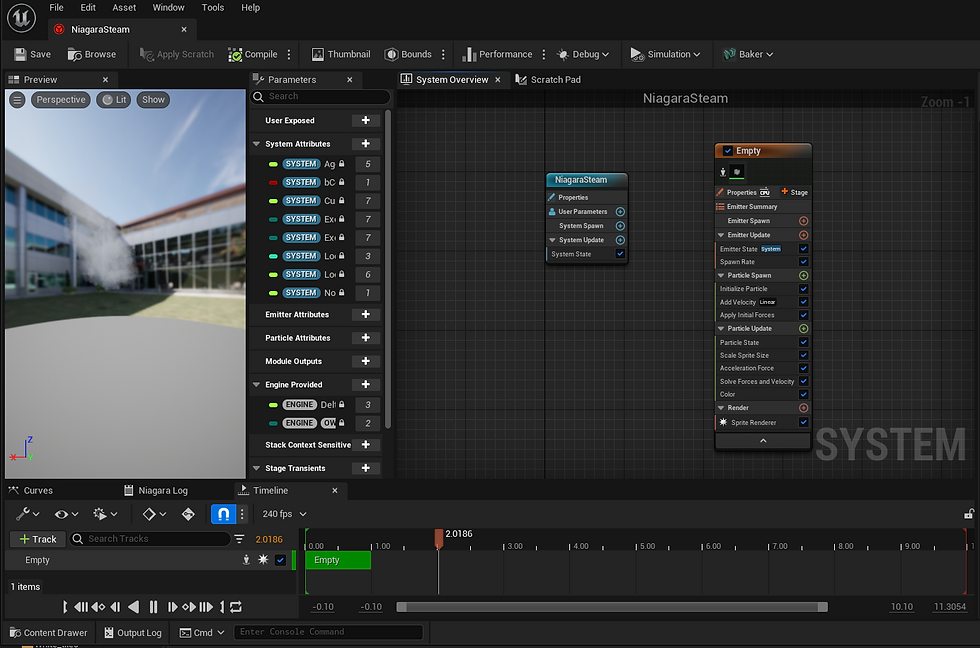
For the living room I also had the two mugs on the table that I wanted to add something too. I created a basic steam texture in photoshop and made it into a little animation to indicate steam coming from the hot coffee. There was a bit of back and forth in the settings to get it to somewhere I was happy with but I really love the final effect. I ended up also placing one by the kettle to show its freshly brewed.
I was quite unhappy with the pink chair model I had and the green footstool that went with it so I decided to remodel both, adding details like seams and improving the basic shapes of both.


I also Uved and textured all side table items and the side tables as well, for example the glass one to the left of the couch I think looks alot better than previous with a transparent glass top.

Back area -


I had quite a bit of work to-do for the back section so started work on modelling all the assets needed for the desk and side tables. One specific model I thought was quite accurate to reference was the telephone on the desk. I recently learned a useful technique that I used for the wire which was creating a curve and extruding a circular plane along it.

I also filled in the side table at the back, this time making sure to UV as I went before repeating the assets.

I was also unhappy with the pink chair in this sections as well so used what I learnt remodelling the other chair to help me recreate this one. I also used the curve technique to create the wooden legs which I think worked really well.


When moving onto texturing I used the same technique for these curtains as I did for the kitchen ones just a different pattern.

And for most assets I used variations of the basic, ceramic, wood and textile textures I made. However, for the phone I did create a more detailed texture by using the same technique I have previously of saving the UV snap shot and drawing onto it to create a custom texture.

Some other notable changes were the photographs I added into the frames. Most of the wall hung ones were just random art that fit the colour palette since no images I found of the paintings were clean enough for me to find the original or for me to screen grab to use. I did however draw the black photo with the brassy subject above below the wall light on the left. It was the main one that was seen and I thought it important to include it even if I couldn't find the original so I just drew the base of the image. I also redid the blue and white side table to look more like the reference and have a cleaner mesh.


Overall changes -
I added glass into all of the windows which I think really changed the look of the room and made it look much more realistic. I also added textures to the buildings in the background and made a basic balcony for the apartment.

I also modelled a basic flower bunch and used it in the plant pots and vases that usually carried flowers in the show. Even though I used the same flower, I used rotation, scaling, different colours and different amounts to make each bunch look a bit different.


Cinematic and post processing -
I did some basic post processing where I adjusted the exposure and added very little warmth to the lighting just to match the tone to the show a bit better.
For my cinematic there was a few shots I changed to better show off the things I was happy with instead of drawing attention to anything that was a bit off. I tried to time the shots to the audio I had ready for the cinematic and think it turned out really well. I turned on manual exposure so found a good exposure amount for the cinematic and put it for all of the shots since the place is pretty evenly lit.
Conclusion -
Overall I think this was a very positive project, while looking back it might've been a better idea to choose a simpler scene with less assets and textures however, I really enjoyed the challenge and found it pushed me to explore new techniques and quicker ways to do things.
Final submit-able portfolio images -


Comments